
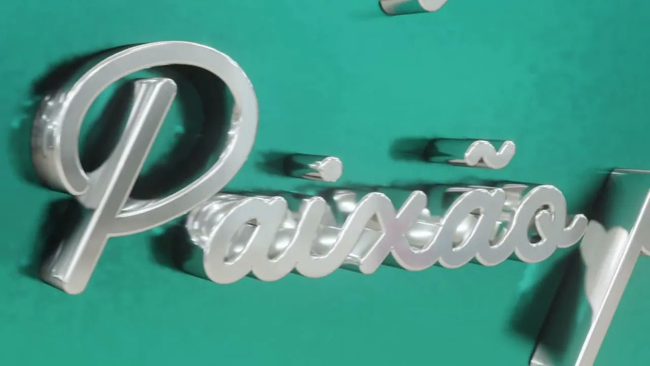
Daniel's Garage
Rescuing great aesthetic references

CLIENT
Daniel's Garage
SERVICE
Branding Design
YEAR
2022
LOCATION
Cachoeirinha, BR
Overview
Daniel's Garage is a brand that offers bodywork and paint services specializing in classic cars. Because of this, the design drew inspiration from the 1950s, particularly the Mid-century Modern aesthetic, Kustom Kulture, and other visually relevant elements from the era, such as service truck doors from that time.
One of the goals of this project was also to set the brand apart from others in the market by conveying a sense of credibility, respect, honesty, honor, and passion.


Challenge
One of the challenges this project presented — though it was also very enjoyable — was diving into the world of classic cars and understanding the deep affection people have for their vintage vehicles. Learning the context, the terminology, and especially the aesthetic was essential to achieving a final result that aligned with the values the brand wanted to convey.
The second challenge was ensuring that the entire identity converged toward the same message. To achieve that, we had to let go of some elements that were well executed but didn’t communicate the right message — such as the mascot. This was one of the most fun parts of the project, but it required a lot of reflection. The original idea was for the mascot to be a cat, as it was the client’s pet.
Within the aesthetic defined by the identity, I designed the mascot, and although it was well executed, it didn’t convey what the brand promised: reliability. Another important factor came from everyday observation — cats, with their sharp claws and tendency to jump on things, often scratch surfaces, including car paint.
From there, I decided to switch the mascot to a dog, which is widely recognized as a symbol of reliability — a key value for a client who entrusts their classic car to someone working with bodywork and paint.
Conclusion: it’s not enough for something to be well executed. Every touchpoint must communicate how the company wants to be perceived.


Brand
The result achieved was a brand that conveys trust, professionalism, and excellence, all while connecting to the culture of vintage cars through an aesthetic inspired by classic vehicles from the 1960s. The symbol of the brand identity is a star, which carries several meaningful associations relevant to the brand, such as:
A symbol of reliability, good service, and honesty (as in star ratings for service quality)
A visual expression of something that is shining or polished
A graphic element characteristic of the 1950s–1960s era, like in the animation The Jetsons
A guiding star — one that points to the right path
Colors
For this visual identity, I used an analogous color harmony with a complementary accent, which brings both contrast and emphasis to the brand. I chose a deep blue and a teal green to differentiate the company from competitors, who often use red. Orange was used to highlight key elements, such as the star. In addition to these, beige adds a classic atmosphere and a sense of refinement to the identity.
Mascot
To make the identity more versatile, humanize the brand, and reference Kustom Kulture—which often features characters—a mascot was developed based on a dog.
This animal was chosen for its strong association with honesty and credibility. However, care was taken to ensure it remained true to the style of characters found in 1950s car customization culture.
Texture
The texture was created referencing the 1950s aesthetic and incorporating the star based on the logo icon. It enriches the visual identity and can be used on its own in brand applications, as it strongly represents the core elements of the identity — whether through its colors or shapes.

